It is 7:12am. A homeowner backs out of the garage, the torsion spring lets go with a bang, and the door drops halfway and jams. Their car is trapped. They grab their phone and search 'garage door repair near me.' They are not comparing wood-grain finishes. They want a phone number, a same-day promise, and proof you are real.
Three hours later, a different homeowner sits with coffee and a design board open. Their builder-grade white door has faded, the panels are dented, and they want the black modern look with the frosted glass row they keep seeing on the nicer houses down the street. They are ready to spend a few thousand dollars. They are not in a hurry. They want to see options.
Both of these people land on your homepage. Most garage door websites are built for exactly one of them and quietly lose the other. That is the core design problem, and almost nobody in this trade solves it on purpose.
The dual-buyer problem is unique to your trade
Plumbers and HVAC companies live with a version of this split, but garage doors are the sharpest case. The repair side is a pure emergency: broken spring, snapped cable, opener dead, car trapped. The install side is a discretionary, visual, high-ticket purchase people research for weeks. Same business, same homepage, two completely different states of mind.
Garage-door customers may arrive with appearance questions, an urgent repair need, or both. Because the door is a prominent exterior feature and an operating system, the homepage should route visitors clearly to design, replacement, maintenance, and repair information the company actually offers.
A configurator can support planned replacement research
A door visualizer can help a visitor explore style, color and options when it accurately represents products the company supplies. Treat its output as a starting point for an estimate, not a final price or guarantee of fit. Installation requirements and the product specification need confirmation.
A configurator can help a prospect explore style, material, color, window, and hardware options before a consultation. It does not establish purchase intent or replace an accurate quote. Use current manufacturer assets and terms, disclose assumptions, verify lead delivery, and compare configured inquiries with qualified appointments and completed installations.
You do not have to build a configurator from scratch. Contractor-focused tools like ConfigViz exist, and several manufacturers let their dealers embed a branded visualizer. The point is that the configurator lives on your site, capturing the lead, instead of sending shoppers off to a manufacturer page where your phone number disappears.
Configurator, dual-buyer homepage, and mobile-first build, done for you.
See how we design garage door websitesServe the emergency without hiding the phone
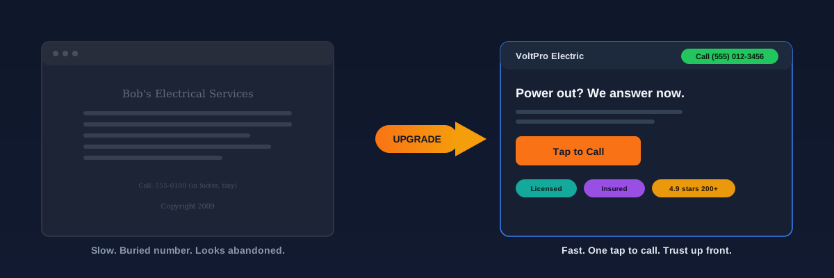
An urgent repair customer may be on a phone and need fast access to current hours, service coverage and a working call path. Test the priority page on real devices and keep the phone number tappable and visible without relying on an unsupported mobile-search percentage.
- Tap-to-call phone number pinned in the header on every page, large and thumb-reachable.
- A same-day service badge above the fold, so the panic buyer sees the promise before reading a word.
- A short, honest emergency line: 'Broken spring? Door stuck? We answer live and dispatch today.'
- Real service-area coverage stated in plain text, so people know you actually come to them.
- A page that loads fast on a mid-range phone on cell data, because a slow load on an emergency search is a lost call.
Speed is not a nice-to-have here. Google's own research has long tied slower mobile load times to sharply higher bounce rates (Google mobile speed studies). For an emergency search that impatience is amplified: the next garage door company is one tap back to the results page.
Test the site on mobile, separate repair requests from new-door consultations and show only verifiable credentials. Use the contractor’s own current estimate examples when discussing price. A generic market range or design statistic cannot predict this site’s conversion rate.
Configurator site versus static gallery site
- Buyer designs their exact door and gets attached to it
- Lead arrives with style, color, and options already chosen
- First sales call is about scheduling, not convincing
- Higher-ticket upgrades surface naturally inside the build
- You capture the shopper instead of losing them to a manufacturer page
- Buyer has to imagine the door on their own house
- Lead arrives vague: 'How much for a new door?'
- First call is spent qualifying and guessing
- Upsells depend on the rep remembering to mention them
- Serious shoppers leave to go play with a manufacturer visualizer
The rest of the homepage, in order
Below the urgent-repair and planned-replacement choices, arrange proof, process, options and contact paths in a deliberate order. Use analytics, recordings where consent allows, and user testing to learn which questions visitors actually need answered.
“The garage door is one of the largest things people see on the front of a house. Selling it with a text list of specs is like selling a paint color by reading the label out loud.”
The split-campaign playbook for emergency repair versus new-install search.
Read the garage door ads companion guideDesign decisions that quietly decide conversion
The big moves get the attention, but a handful of smaller design choices decide whether a good-looking site actually turns visitors into calls and configured quotes.
- Keep the palette tight: one strong action color, a neutral background, and a single accent. Busy sites read as amateur and bury the buttons that matter.
- Design mobile-first, then scale up. Most of your traffic is on a phone, so the phone layout is the real design, not an afterthought.
- Make buttons look like buttons. 'Call Now' and 'Design Your Door' should be impossible to miss and obviously tappable.
- Cut the navigation. A repair buyer and a shopper each need one clear path, not a menu with fourteen links.
- Write for scanning: short paragraphs, plain headings, and no wall of text. People decide in seconds whether you are worth a call.
What this looks like when it works
A site built this way can support distinct urgent-repair and planned-replacement journeys. Test whether mobile callers reach a staffed route and whether configurator selections arrive accurately with qualified quote requests. Use those records to improve the flow instead of assuming a fixed visitor behavior.
Use the homepage to distinguish repair and installation needs, then test whether a configurator helps installation shoppers understand options before contacting the company. Evaluate it through completed interactions and qualified inquiries rather than assuming it sells automatically or explains why another site underperforms.
We build dual-buyer homepages with a lead-capturing configurator for home-service companies.
Book a call about your garage door siteAnother exterior, photogenic trade where showing beats telling.
See a visual-purchase site analog: sidingSources and further reading
- Google Search: SEO Starter Guide
Crawlable links, descriptive page information and content organization. Practical trade examples are SF Web Tech recommendations.
Source checked .
- Google Search: creating helpful content
People-first writing, useful original information and the absence of a preferred word count. Does not substantiate a client result.
Source checked .
- Google Maps: prohibited and restricted content
Rules against fake engagement, incentives and selectively soliciting positive reviews.
Source checked .